Why Farmhouse Kitchen Colors Matter
Imagine walking into a kitchen that feels like a warm hug from your grandma – that’s the magic of farmhouse color palettes. These aren’t just paint choices; they’re a mood, a lifestyle, a connection to something timeless and comforting.
The Perfect Farmhouse Color Palette: Breaking It Down
1. White: The Ultimate Farmhouse Foundation
Whites aren’t boring – they’re magical!
- Simply White by Benjamin Moore
- Dover White from Sherwin Williams
- Crisp, clean, and endlessly versatile
Pro Tip: Think of white as your kitchen’s blank canvas. It’s like the perfect white t-shirt that goes with everything.
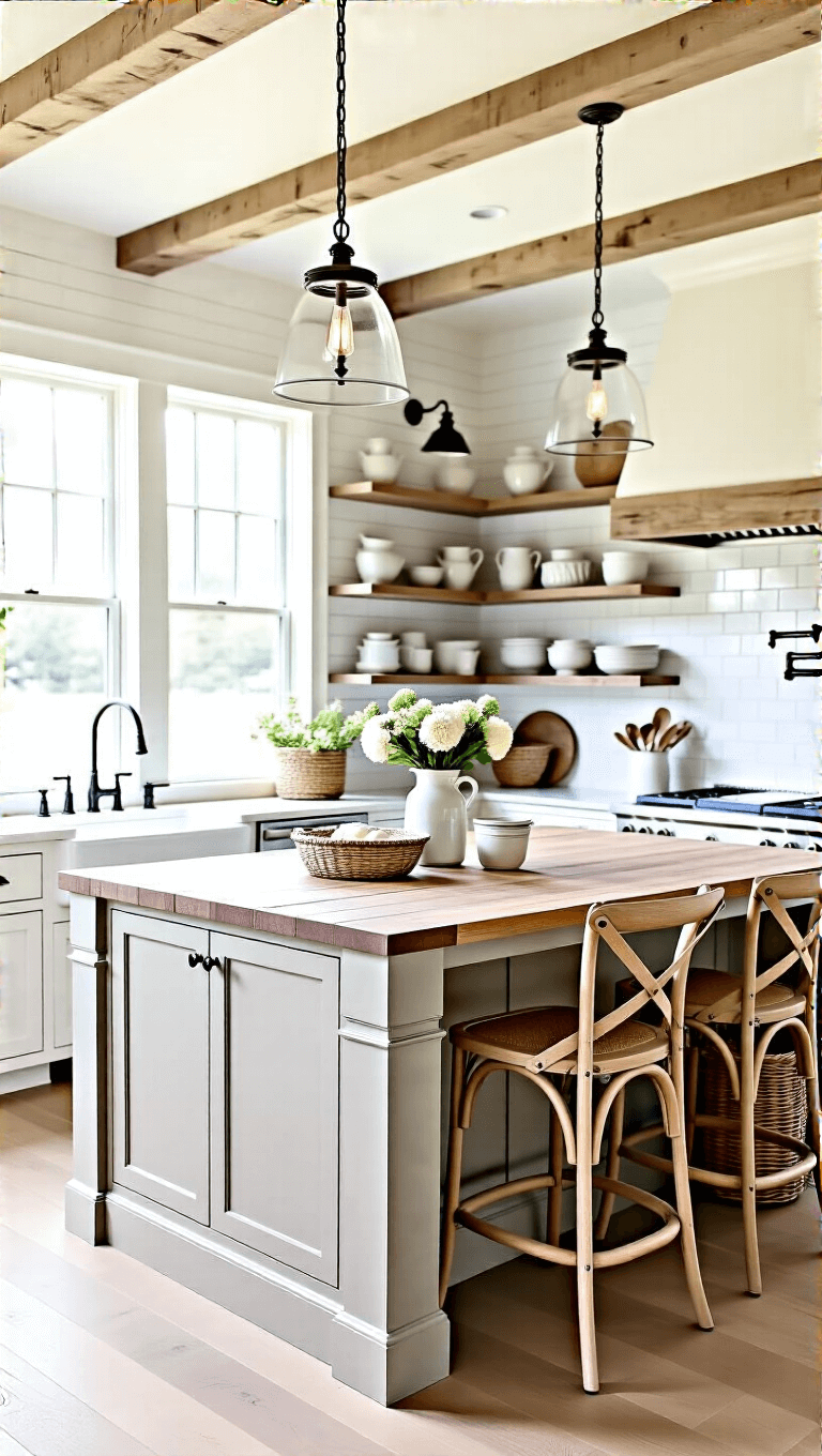
2. Greige: The Color Chameleon
Greige is basically the superhero of farmhouse colors. It’s:
- Neither too gray
- Not quite beige
- Perfectly neutral
- Looks amazing with wood tones
- Recommended pick: Fall Chill by Pittsburgh Paints
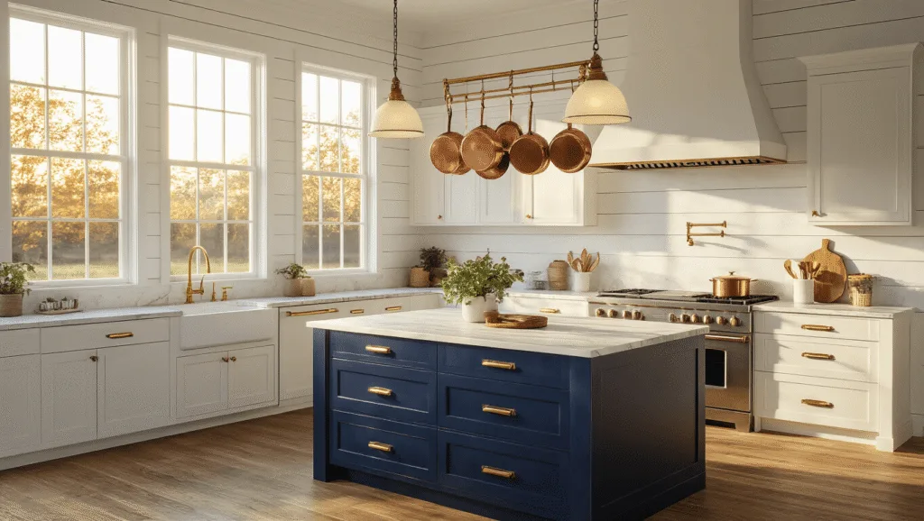
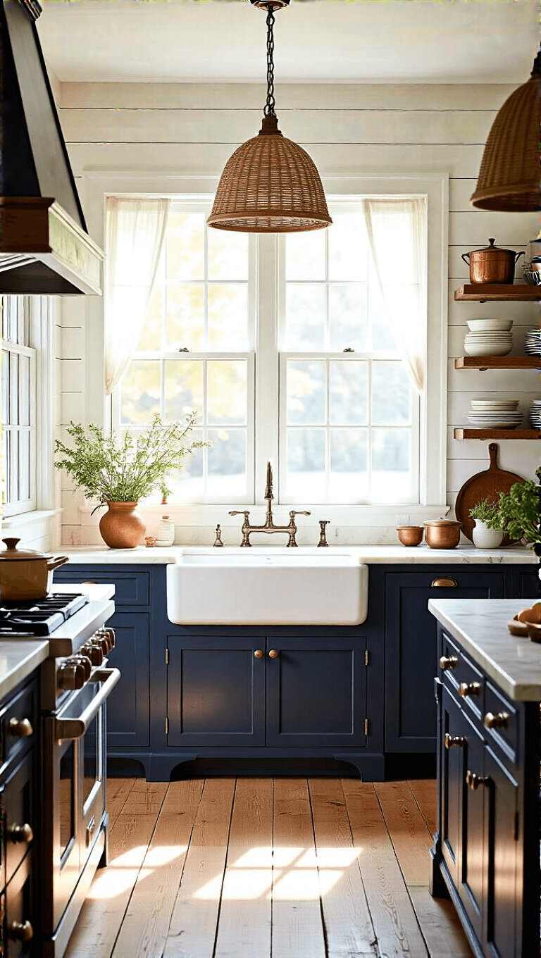
3. Soulful Blues and Greens
Want to add some personality? Blues and greens are your best friends:
- Westcott Navy (bold statement pieces)
- Soft sage greens
- Cornflower blue for island accents
- Liveable Green by Sherwin Williams
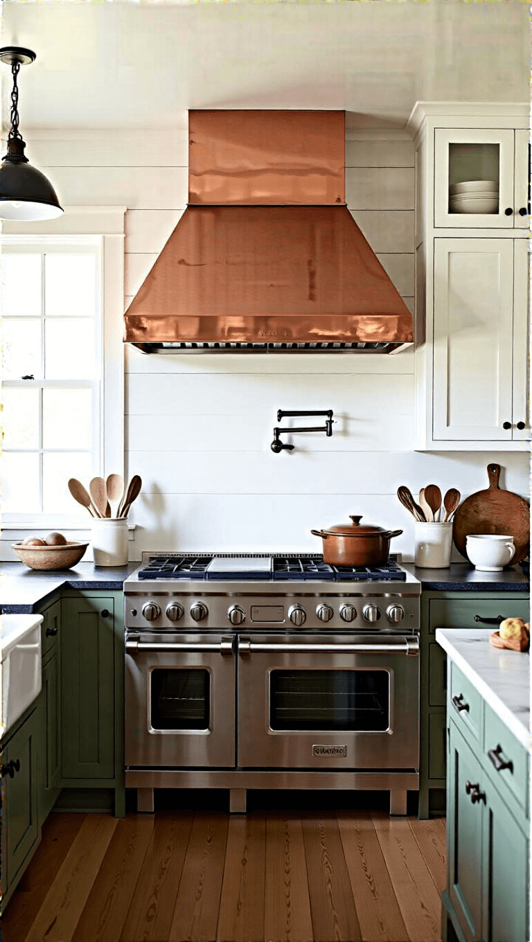
4. Warm Earthy Tones
Bring the farm inside with:
- Terra-cotta reds
- Sudbury Yellow
- Natural browns
- Gypsum by Pittsburgh Paints
Design Secrets for Farmhouse Color Success
Layer Like a Pro
- Mix whites with subtle color pops
- Combine painted cabinets with natural wood
- Use brass or vintage hardware
- Play with textures
Lighting is Everything
Natural light can dramatically change how your colors look. What seems soft in morning light might feel completely different at sunset.
Top Brands for Farmhouse Kitchen Colors
- Benjamin Moore: Masters of subtle, sophisticated palettes
- Sherwin Williams: Consistent, reliable farmhouse colors
- PPG: Innovative and fresh color collections
- Farrow & Ball: Luxury farmhouse color experiences
Final Color Wisdom
Remember: Farmhouse isn’t about perfection. It’s about creating a space that feels lived-in, loved, and tells a story.
Start with a neutral base, add personality with strategic color choices, and most importantly – have fun with it!
Quick Recommendation
If you’re overwhelmed, here’s my go-to formula:
- 70% Soft White
- 20% Greige
- 10% Accent Color (blues, greens, or warm yellows)
Pro Styling Hack: Always get sample swatches and test in YOUR specific lighting. Colors can be sneaky little chameleons!
Happy painting, design warriors! 🎨🏡